An Enchanting Brand Makeover
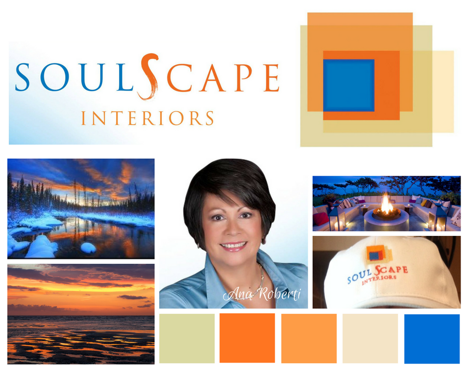
BEFORE
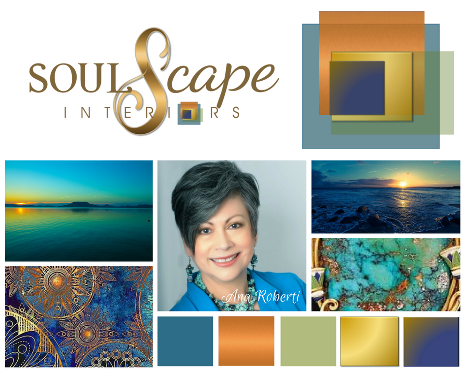
AFTER
Both Brand Identities and Images convey subliminal messages. But only ONE speaks the true essence of SoulScape Interiors.
But was there anything really “wrong” with the former brand identity?
The answer is No. …and Yes. What was right about it was that it reflected what Ana had submitted as inspiration for her color palette and vibe to her previous brand designer. The brand was professionally executed. The original identity was cohesive and consistent. What was wrong with the branding was that it wasn’t fully aligned with who Ana and Joe are or with “who” their brand is.
Ana leads with Dazzling Radiance — warm, deep, dynamic. Dazzling Radiance carries intensity. Presence. Soul. She knows how to connect to her clients and “dig in” to help them reflect their style and personalities in their own spaces. Joe is also deep and thoughtful. He brings his own gift for detail and connection.
This wasn’t a brand makeover.
It was a refinement.
The refined brand expression reflects that more clearly.
More aligned with her Dazzling essence.
The people she is meant for sense it when they meet her or see her branding in action.
They feel the authenticity.
And that changes how they respond.
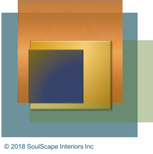
People have asked, “What do those boxes in the logo mean?”
As an interior designer, Ana created the boxes motif as an outline drawing years ago to represent the spaces within a project, and how the layers draw you in deeper. As you can see with the new color palette, the dimension speaks to the elements of earth and soul.
The two metallics (copper and gold) represent the element of metal, of course, the green- earth/life/renewal, the teal for water/soothing/sanctuary, and the indigo for Air/cosmos/depth/soul. And the very special “S” hints at the symbol for infinity, which speaks to the soul’s expression of living.
The logo and color palette aren’t the only things that look different.
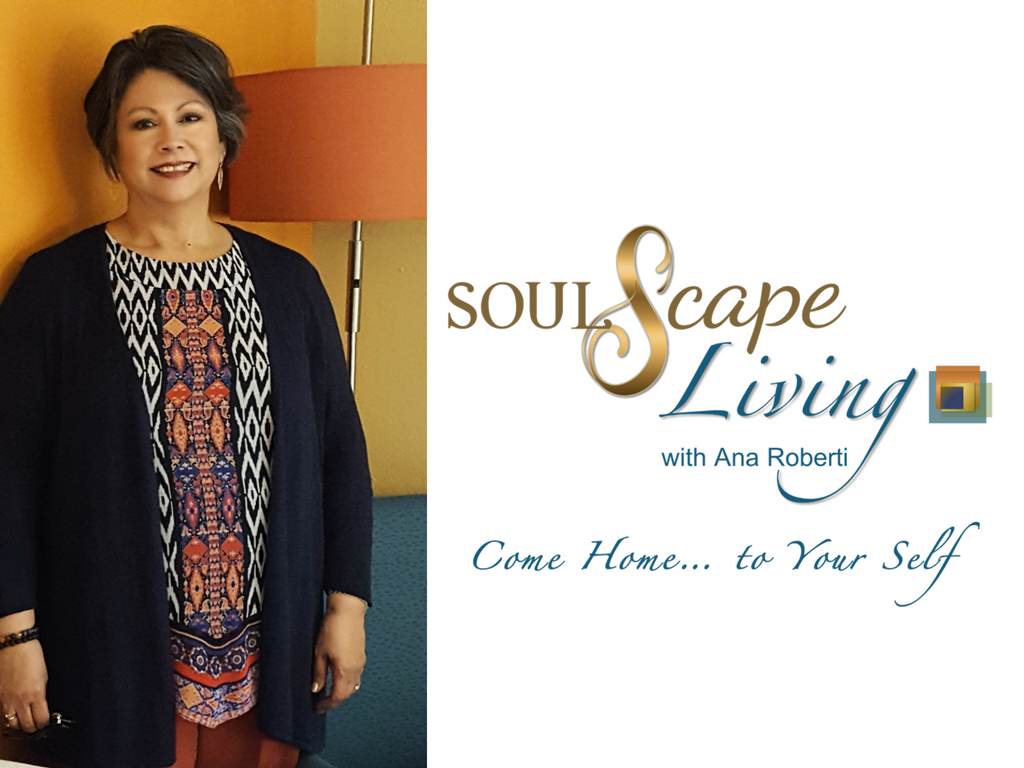
We’ve sprinkled Faerie Dust on pretty much everything. A brand new website (soulscapeinteriorsinc.com) with fresh images of recent projects, all the print and digital collateral will reflect the new branding, and SoulScape’s TV show, SoulScape Living will also have a new look with it’s own version of the new branding.
The new branding represents the creativity, quality, and attention to detail that SoulScape Interiors is committed to offering their clients. With a fresh brand, comes a fresh energy and spirit. Visual expression is essential for fast and effective communication. Ana and Joe of SoulScape Interiors really get it…
and now…
It shows. 🙂
Click the Gallery Images to View More
SoulScape Living PPT Intro Page B
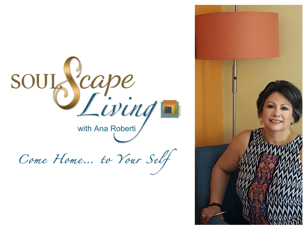
SoulScape Living PPT Intro Page A
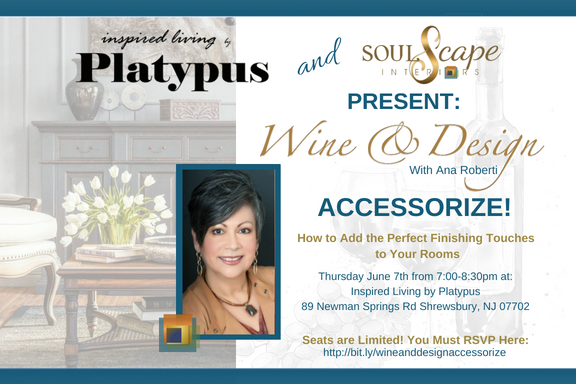
Post Card Design for Event

Ana’s Speaker One Sheet Front
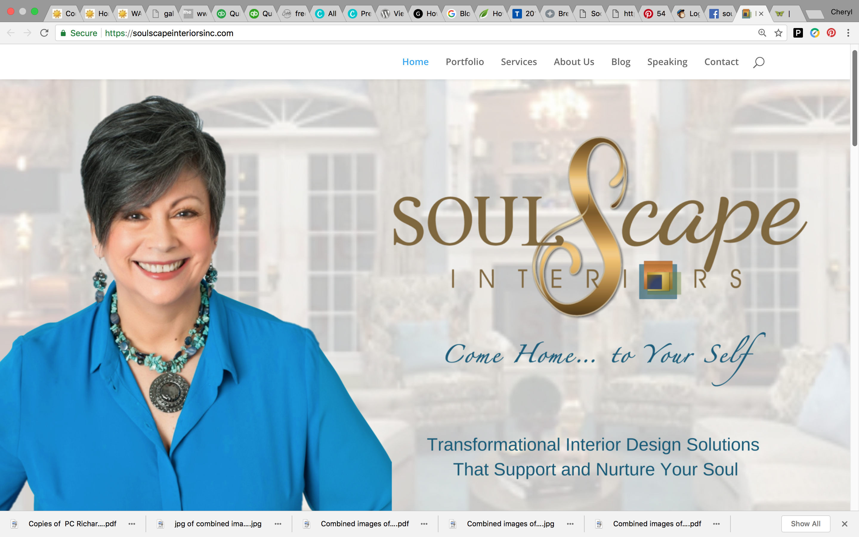
SoulScape Home Page Header
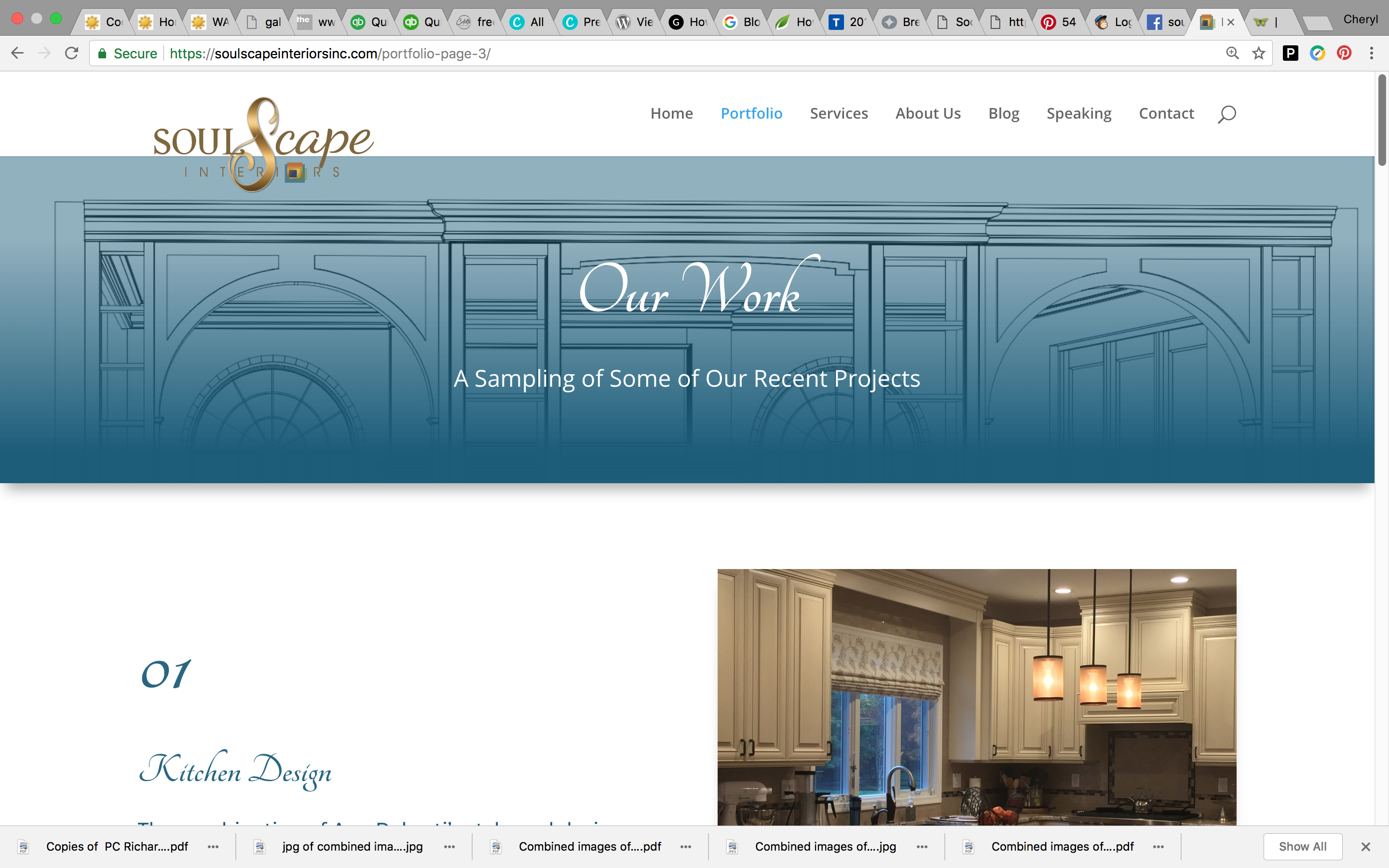
A SoulScape Web Page

Ana Before and After Enchant Your Style ™
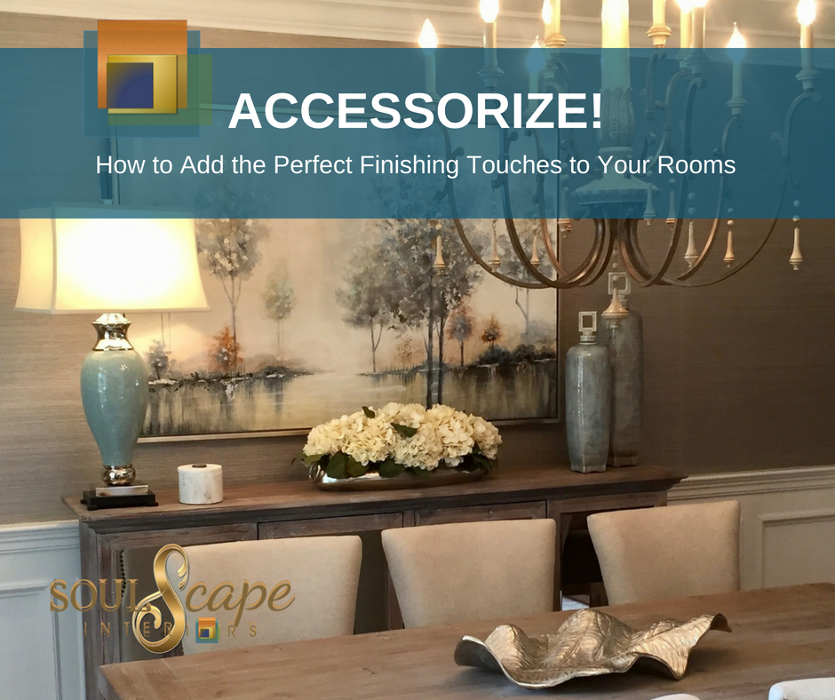
Tips Card Front
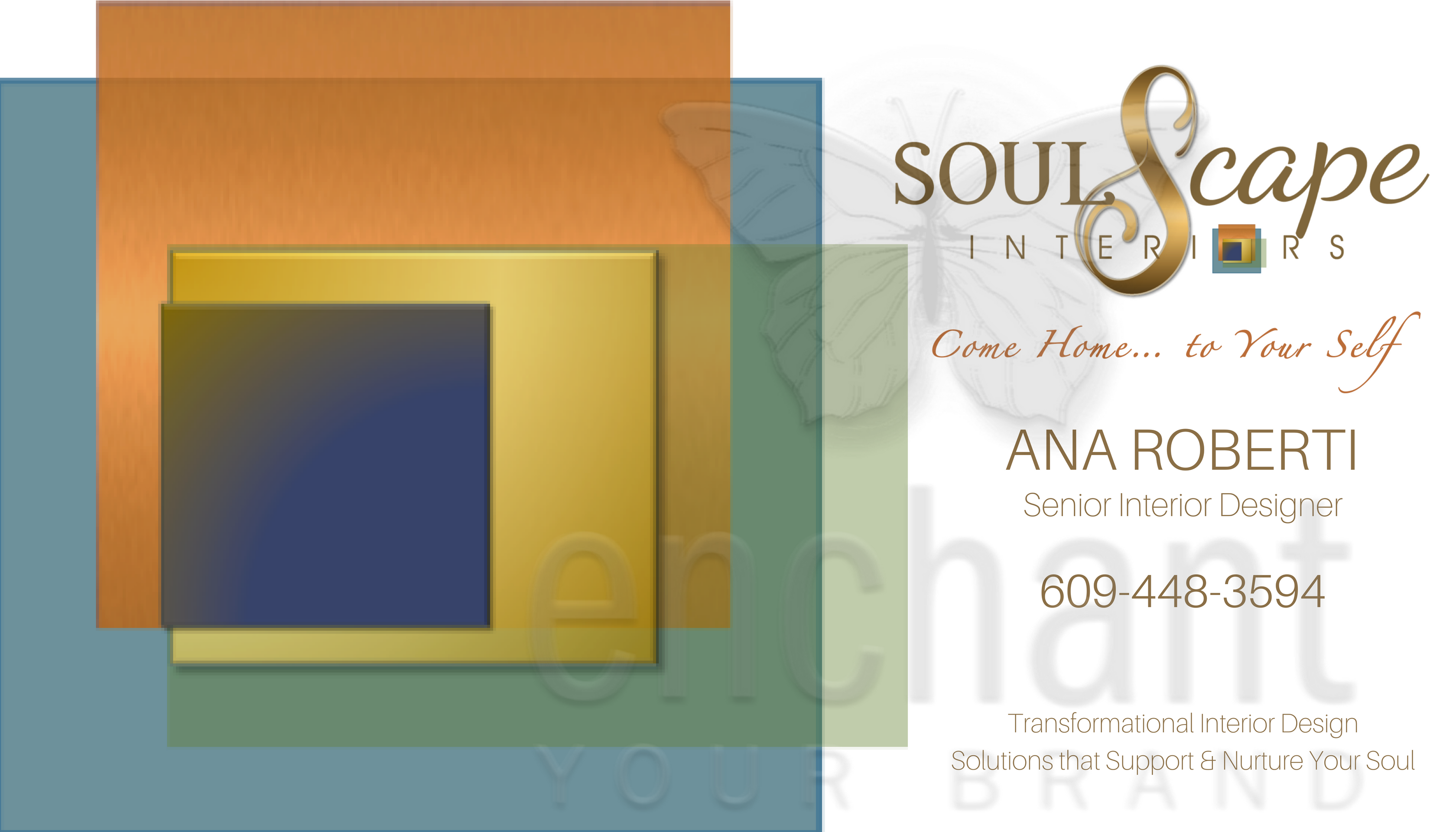
Ana’s Biz Card -Front
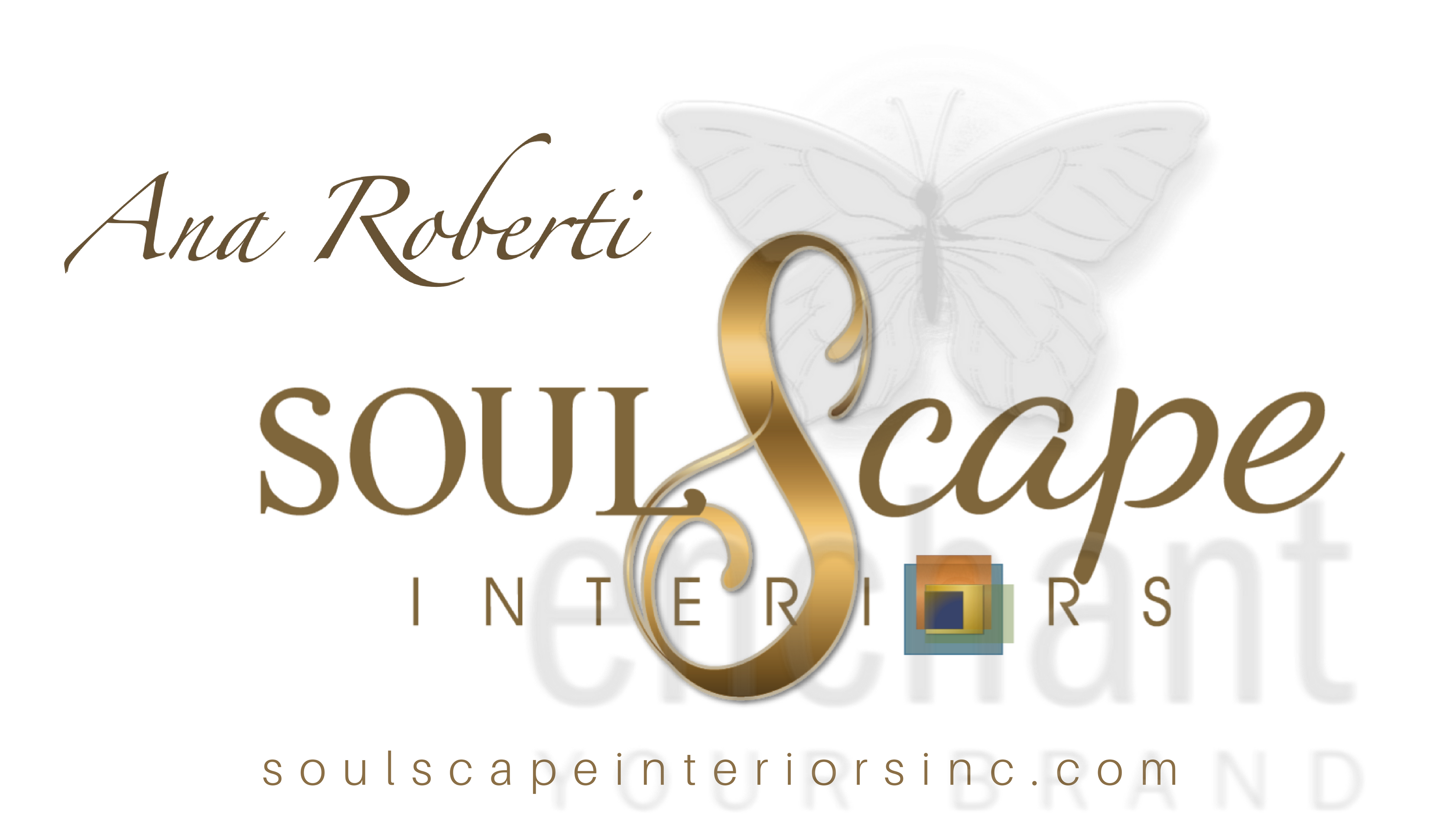
Ana’s Biz Card -Back

eBook cover
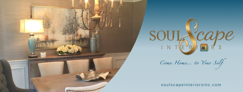
SoulScape Interiors Inc FB Header